A trade partner sent me a screenshot last month: a buyer messaged him about a card listed for \$320, asked if he had "a better photo because the card looks beat in this one." The card was a fresh PSA 10. The buyer was reading the photo, not the card. That's how much photography matters to the perceived value of a collection.
Most photo mistakes aren't about camera gear. They're about a handful of specific choices — angle, light, backdrop, distance, framing — that any phone can fix. Here are the 8 that make collections look cheap, in roughly the order I see them in the wild.
Key Takeaways
- Direct overhead lighting is the #1 mistake — it kills holo foils, flattens detail, and produces hotspots. Move the lights to 45 degrees off-axis and the same card looks 10x better.
- Backgrounds matter more than cameras. A cluttered counter or beige carpet makes a PSA 10 read as a kid's collection. A matte black backdrop costs \$10 and instantly upgrades every shot.
- Camera distance is invisible until it's wrong — too close warps the card edges via lens distortion, too far flattens depth. A consistent 12-16 inch distance handles 90% of shots.
- Most filters labeled "Vivid" or "HDR" oversaturate colors past what cards actually show. Trade partners and buyers learn to mistrust filtered photos.
1. Direct overhead lighting
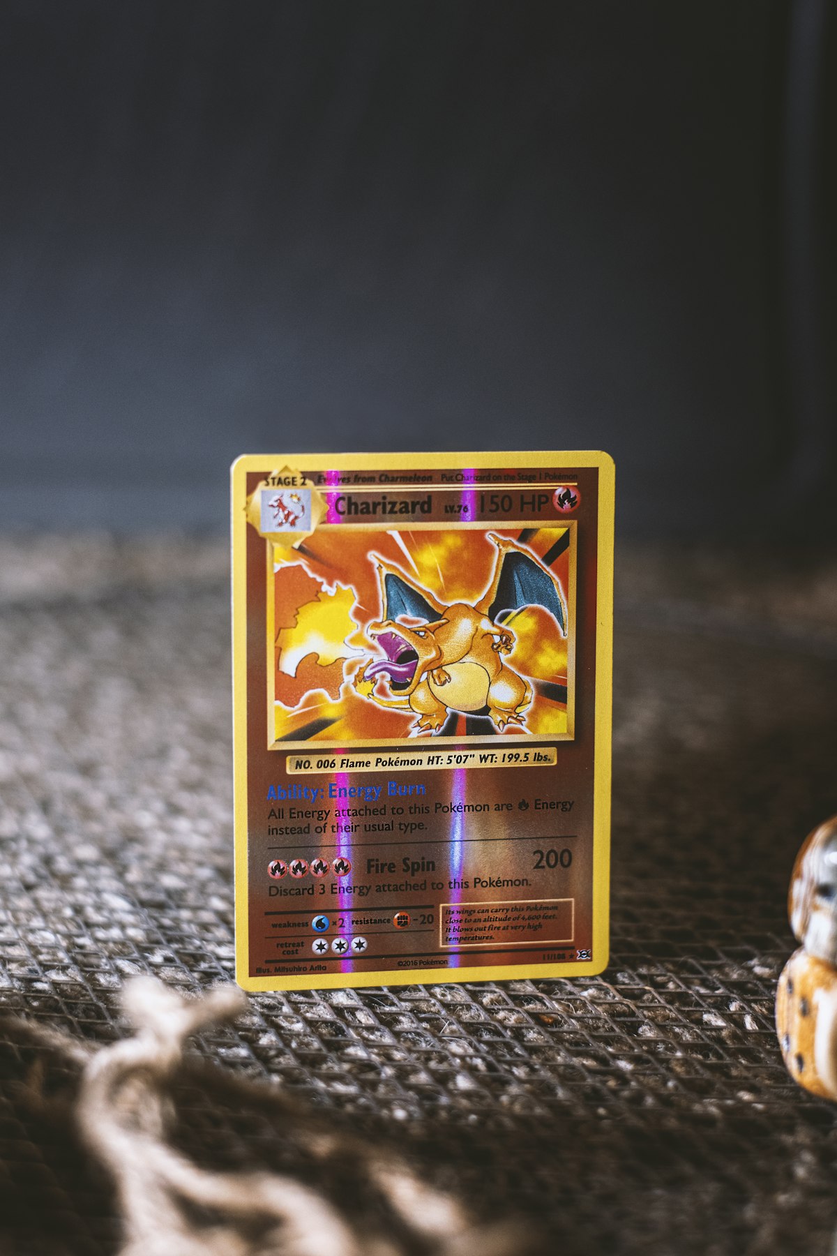
The kitchen ceiling light. The desk lamp pointed straight down. Anything that hits the card from directly above is the single most common photo killer. It produces one of two failures: either the foil reflects straight back into the camera as a giant white hotspot in the middle of the card, or it kills the foil's color shift entirely and the holo looks like a regular flat card.
Fix: Two LED panels positioned at 45 degrees off the camera axis on either side of the card. Or one panel at 45 degrees with a white bounce card on the opposite side. The angled light skims across the foil surface and reveals the pattern. We cover the full 45-degree lighting setup in detail.
2. Mixed color temperatures in the same shot
Daylight panel on one side, warm desk lamp on the other side, room light overhead. The card ends up with a yellow tint on one edge, a blue tint on the other, and a muddy middle. White balance can't fix multi-source casts because there's no single neutral reference.
Fix: Turn off everything except your shooting lights. Use matching color-temperature sources — both lights at 5500K daylight, both at 3000K warm, but never mixed. Most collectors should shoot at 5500K because daylight is the reference standard for accurate color.
3. Cluttered backgrounds
A PSA 10 Charizard on top of a stack of paperwork, with a coffee mug edge in frame and a power strip in the corner. The eye doesn't know where to look. Whatever the card is worth, the photo says "hobby corner."
Fix: Matte black PU leather mat, 16x24 inches minimum, that you can roll up and store when not shooting. Total cost under \$20. Lay it down, place the card in the center, and instantly your photos read as intentional rather than accidental. Light gray works as a second choice for cards with heavy black content.
4. Shooting too close
Phones have wide-angle lenses by default. Get within 4-6 inches of a card and the lens distortion barrel-warps the edges — cards look like they're bowing outward in the middle. It's subtle but every viewer notices subconsciously, and serious buyers will assume the card is physically warped.
Fix: Shoot from 12-16 inches away and crop in during editing if needed. Or use your phone's portrait/2x lens mode for a more natural focal length that doesn't distort. The phone's main lens at distance always beats the phone's main lens at close range.
5. Filters and oversaturation
The "Vivid" filter, the HDR boost, the social media app's auto-enhance. They juice colors past what the card actually shows. Reds look orange, greens look fluorescent, and holos look fake. Buyers and trade partners on r/PokemonTCG have a developed eye for this — oversaturated photos signal either inexperience or, worse, an attempt to hide actual condition issues.
Fix: Edit conservatively. Brightness up if needed, slight contrast bump, that's it. The goal is the card looking exactly the way it does in your hand, not better. Build trust with realistic photos and your trade and sale offers will improve over time.
6. Random angles and inconsistent framing
One photo dead overhead, the next at a weird tilt, the next half-cropped. Strangers swiping through your IG or Reddit post can't tell what they're looking at because each frame asks them to recalibrate. Inconsistency reads as carelessness, which reads as low value.
Fix: Pick one framing system and run it. For static product shots: dead overhead, card centered, equal margin on all sides. For video: 30-degree angle from above, locked tripod, card in lower two-thirds of frame. Consistency is what makes a feed look like a collector rather than a kid posting pulls.
7. Shooting through plastic that didn't have to be there
Raw card still inside a toploader. Slab inside a magnetic case inside another sleeve. Every layer of plastic between the camera and the card adds reflection, slight color shift, and visual distance. Slabs are designed to be shot through — they're optically clear. Toploaders aren't — they always show on camera.
Fix: Take the card out of the toploader for the photo. Put it back after. The 15 seconds of handling are worth the photo quality. For graded slabs, clean the slab surface with a microfiber cloth before each shot — fingerprints and dust read clearly on camera and make the card look unloved.
8. Skipping the binder cover shot
Binder content videos that open mid-flipthrough without showing the binder closed first miss the strongest visual hook. The binder cover is the title card of the video — it sets expectations and establishes the production quality. Going straight to a pages-only sequence makes even a great collection feel like a flip-fest of loose cards.
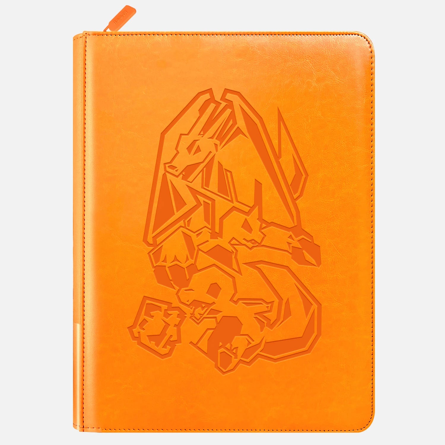
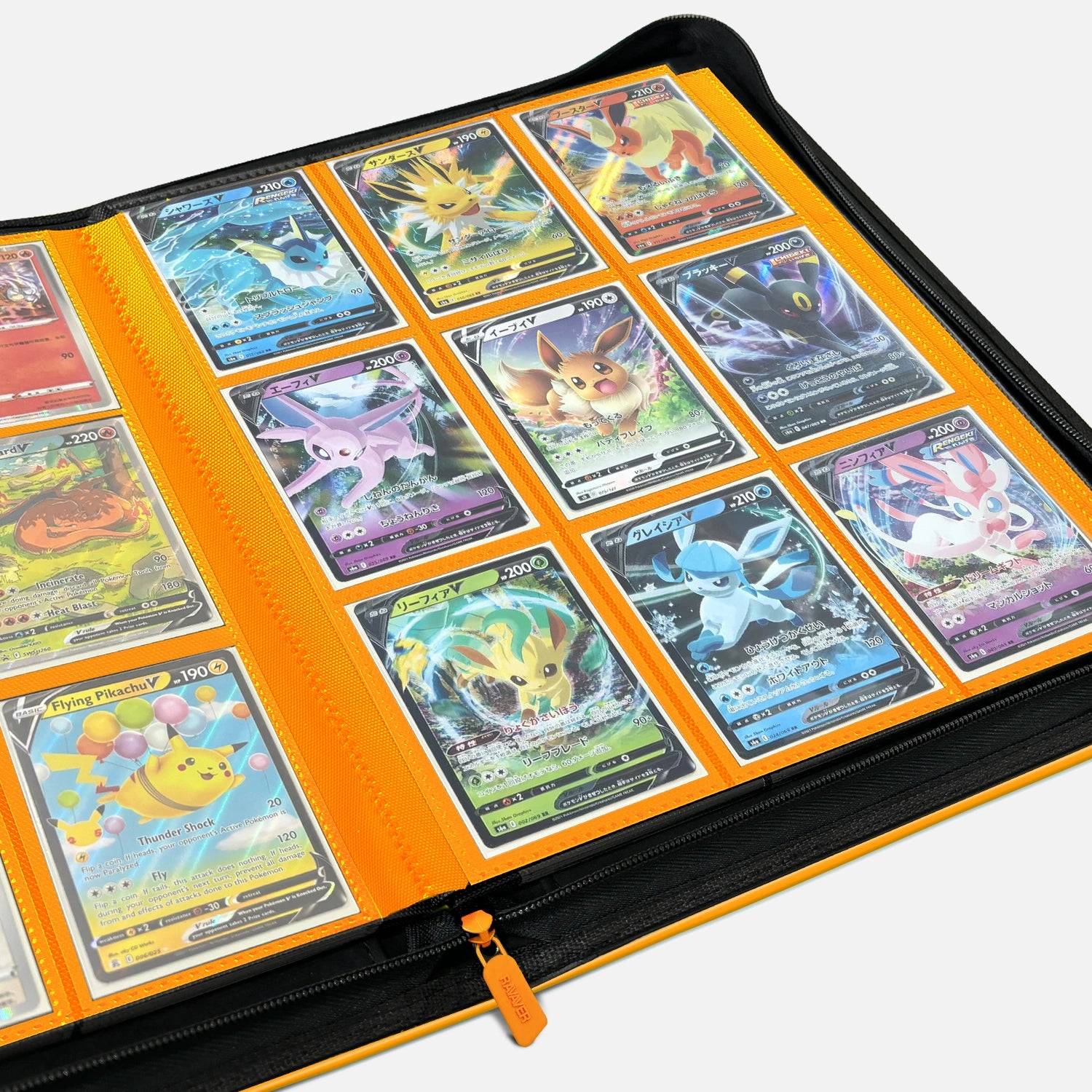
Fix: Always open and close binder content videos with a 2-3 second hold on the closed binder cover. If the cover is generic or beat up, that's the bottleneck — a quality show-binder with Pokemon-themed cover art reads instantly on camera and frames the cards inside as worth the trouble of opening.
The bigger picture
If you scan your last 10 posted photos and find more than two of these mistakes, that's the friction point holding back your content. The good news is that none of them need new gear — they need a 30-minute setup change and a slight shift in editing habit. The same Charizard you've been posting for months can read three tiers higher in perceived value with these fixes alone.
The other piece worth noting: your photos are the silent half of every trade negotiation, every potential sale, and every social moment that drives someone to ask "where'd you get that?" Reddit's r/PokemonTCG users will scroll past a great card with a bad photo and stop on a mid card with a great photo. The photo is the gate. Get through it and the collection speaks for itself.
Frequently Asked Questions
Will a better phone fix any of these mistakes?
A newer phone helps marginally on low-light performance, but every mistake in this list is about technique, not hardware. A 2020 iPhone with the right lighting setup will beat a 2024 phone with the wrong setup every time. Spend on lights and a backdrop before considering a phone upgrade for card content.
How do I tell if my photos are actually bad or just my self-criticism?
Post the same card with two photos — your current setup and the same shot with one improvement (better backdrop, light moved off-axis, etc.). Compare engagement. The platform will tell you within a week which version readers respond to. Comments asking for clarification or "better pic" are a clear signal something needs to change.
Are flatlay photos still relevant in 2026, or is everyone doing video now?
Both work. Reddit and Instagram feed posts still favor strong static photos. TikTok, Reels, and Stories favor short video. Most successful collector accounts produce both formats from the same setup — same lights, same backdrop, different framing. Pick the platform you care most about and optimize the format that performs there, but the underlying photo skills carry over either way.
What's the single biggest upgrade I can make in 10 minutes?
Move your light source 45 degrees off the camera axis. If you've been shooting under an overhead light, just sliding to one side of the card and turning the card slightly toward the light will transform every photo. Do this before buying any gear.
Should I retake old photos of my collection?
If you're using those photos for sales listings, trade screenshots, or insurance documentation, yes — the photos are doing real work and bad photos cost real money. If they're personal records or old Instagram posts, less urgent. Focus on getting new photos right going forward.
Why do my photos look great on my phone but bad when I post them?
Social media compression. Instagram, TikTok, and others compress images and videos heavily on upload. Subtle detail and shadow gradient get crushed. Compensate by shooting slightly brighter, slightly higher contrast than looks ideal on your phone screen. The compression will pull it back to looking right after upload.
Can I use the same setup for all my cards or do I need different setups for different types?
One setup handles most cards. Slight adjustments help: graded slabs benefit from steeper light angles (60 degrees off-axis) to cut glare on the plastic, and very dark cards like Umbreon or Gengar look better against a light gray backdrop instead of black. Build the standard 45-degree daylight setup first, then make minor tweaks per card type as you go.
Next step
Pick the one mistake on this list that hits closest to home and fix it this week. Probably the lighting angle or the background — those are the two with the biggest visual impact. If you're upgrading the binder cover that shows in your videos, the Ravaver binder collection has Pokemon-themed covers that hold up under the same lighting setup you're using for cards.
Sources: